
Color Psychology In Interior Design
色彩心理学は、空間内の雰囲気や雰囲気に影響を与える色の戦略的な使用に関係するため、インテリア デザインにおいて重要な要素です。色には特定の感情的な反応を呼び起こし、部屋の雰囲気を決める力があるため、家族や社会的な交流、また個人的な内省やリラクゼーションの時間に応える環境を作り出すには、カラーパレットの慎重な選択が不可欠です。色の心理効果はその色調、色相、彩度によって異なります。これらの効果を理解することは、ダイナミックでありながら静寂な空間をデザインするための基礎となります。
インテリア デザインの文脈では、海、ビーチ、森林に関連した色は、静かでありながら魅力的な環境を作り出すのに特に効果的です。これらの自然要素は、住宅のプロのインテリア デザインに変換されると、平和、静けさ、屋外とのつながりの感覚をもたらすことができます。これは、共同の集まりと一人でのリラクゼーションの両方を促進するように設計された空間では特に重要です。
海や空を連想させることが多い青は、その心を落ち着かせ、心を落ち着かせる性質があるため、インテリア デザインにおいて最も多用途な色の 1 つです。
柔らかい水色や淡い海の青などの明るい青の色合いは、平和、静けさ、開放感を呼び起こし、静かに熟考するための隠れ家として機能する空間に最適です。これらの色合いは、穏やかでリラックスした雰囲気を作り出すことができるため、寝室、リビングルーム、読書コーナーでよく使用されます。
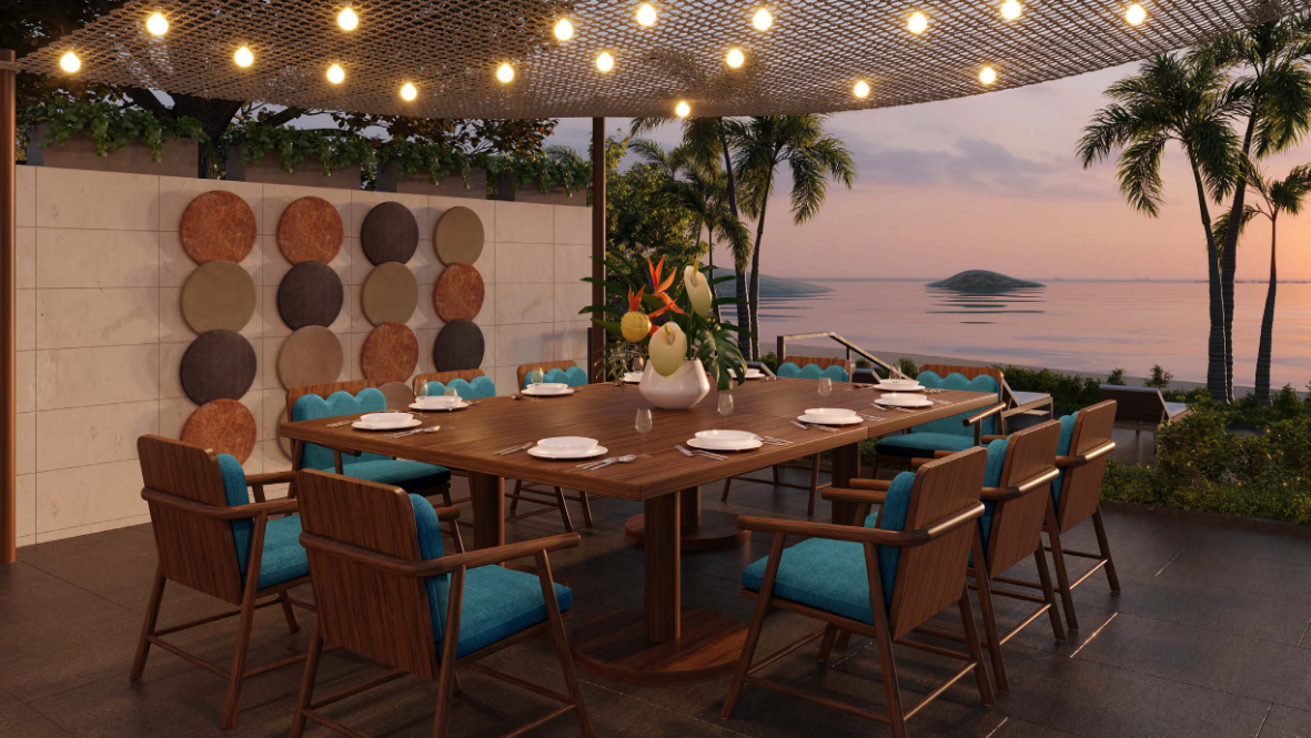
ネイビーやディープオーシャントーンなどの暗い青の色合いは、洗練さと深みの感覚をもたらし、よりフォーマルまたは親密な雰囲気が求められるダイニングルームや共同リビングエリアなどの社交スペースに適しています。これらのより深いブルーは、空間を圧迫することなくエレガントな要素を加えることができるため、社交的な交流と個人的な内省の両方に最適です。
緑も一般的に自然、特に森林に関連付けられている色であり、その心理的効果は再生、成長、バランスの感情と密接に関係しています。インテリア デザインでは、さまざまな色合いの緑を使用して、自然界との調和とつながりの感覚を作り出すことができます。
シーフォーム グリーンなどの明るい緑は、心を落ち着かせてさわやかにする性質があるため、寝室や瞑想エリアなど、リラクゼーションが優先される空間でよく使用されます。深い森や深い葉を思わせる濃い緑は、部屋に豊かさと接地効果を加えることができるため、ダイニング エリアやホーム オフィスなど、社交的な交流を目的としたスペースに最適です。
緑は多用途性があるため、静かな雰囲気を呼び起こすことから、社交的な集まりのためのより活気に満ちた環境を促進することに簡単に移行できるため、室内空間のバランスを作り出すのに貴重な色となっています。
砂、ベージュ、ライトブラウンなどのニュートラルな色調は、多くの場合、ビーチや森林の自然な色調に関連付けられます。これらの色はインテリア デザインの基礎要素として機能し、大胆な色の選択のインパクトを高めたり、単独で使用して暖かさと快適さを呼び起こすニュートラルな背景を提供します。
ベージュと砂の色調をリビングエリアやオープンコンセプトのスペースに使用すると、家族の集まりやゲストのおもてなしに適した、居心地の良いリラックスした環境を作り出すことができます。これらの色の暖かさは、自然のビーチ風景の心を落ち着かせる効果を模倣し、カジュアルで魅力的な雰囲気を促進します。同時に、その中立性により、寝室や個人の勉強スペースなど、一人でリラックスしたり熟考したりするための場所で、心を落ち着かせる影響力を与えることができます。
個々の色の特定の感情的効果に加えて、室内空間でこれらの色合いを適切に組み合わせることで、社会的ニーズと個人的ニーズの両方に応える、よりバランスのとれた環境を作り出すことができます。
柔らかい青と緑をサンドベージュの色調と組み合わせて使用すると、集まりに活気があり魅力的な雰囲気を維持しながら、リラクゼーションを促進する海岸のテーマを呼び起こすことができます。このクールなトーンとニュートラルなトーンの組み合わせは、オープンで広がりを感じる美学を生み出すことができ、これは社交的な交流のために設計されたスペースに不可欠です。ネイビーやフォレストグリーンのアクセントなどの暗い色調を追加すると、深みと洗練さが加わり、空間に地に足が着いた感じがして、よりフォーマルな場面や親密な場面に適したものになります。
リビングルームやオープンプランのキッチンなど、共有エリアと個人の隠れ家の両方として機能することを目的とした部屋では、空間内のさまざまなゾーンを定義するために色を選択的に使用することも重要な戦略です。
青と緑の明るいカラーパレットは、読書コーナーや静かなコーナーなどのリラクゼーションを目的としたエリアの境界線に使用でき、より大胆なまたは暗い色合いは、ダイニングテーブルの周りや座席などの社交を目的としたエリアに導入できます。会話を想定したアレンジメント。これにより、一貫したデザインの美学を維持しながら、空間のさまざまな機能間の集合的な移行が可能になります。
結局のところ、インテリア デザインにおける色の心理的影響は、家の雰囲気を形作るための強力なツールとなります。インテリアデザイナーは、望ましい感情的な反応を呼び起こす色を慎重に選択することで、家族や社交の集まりにも、熟考やリラクゼーションの静かな瞬間にも同じように役立つ環境を作り出すことができます。これら 2 つの機能のバランスをとることが目標の住宅では、ハワイの海、ビーチ、森林からインスピレーションを得た色を使用することで、全体的な生活体験を向上させる自然で調和のとれた背景を提供できます。